
There are lots of different theories one can use as the basis for creating an OOH advertising strategy, but honestly, sometimes keeping it simple is the best approach. A recent ad campaign by Belinda Gillies Art & Design for CeeBee Care, an in-home Australian childcare service, demonstrates this brilliantly. Let’s take a closer look.
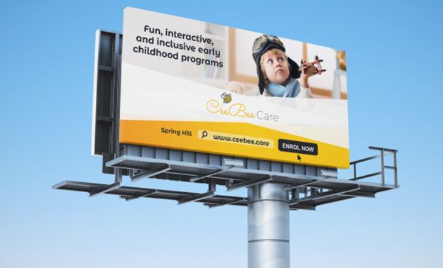
First, let’s study the billboard ad in its totality. When we do that, a few different elements jump out. Note the layout of this design. There’s very little text or clutter. The message is simple and simply conveyed by a single block of text and a fun image of a child at play, with the company’s name and website information beneath.
This, in our view, is advertising at its finest and most effective. A driver passing this billboard can tell at a glance what the company is offering, who the target market is, and see a means of finding additional information when they get home. Perfect, and by all accounts, the ad was a smashing success, though this design, unlike some of the others we’ve talked about in previous months, isn’t flashy or showy, and as such, it did not foster lively debate and discussion online and wasn’t widely shared.
That’s fine. Successful ads can do those things but they don’t need to, and let’s face it, not every billboard ad design can, or is destined to become a viral sensation. It’s a beautiful thing when it happens though.
Instead this ad seeks to maximize its effectiveness by being brilliantly designed and laser focused on its message, and it exceeds expectations on that front. If you’re looking for an ad to emulate, this would be an excellent choice, and if you need help figuring out how to apply these design principles to your next ad campaign, we’ve got you covered. Just give our office a call at 404-671-9490.