In the world of billboard advertising, we increasingly see incredibly elaborate billboard designs that really push the envelope, incorporating the latest technology into their designs in a bid to create an image so compelling that it simply demands attention.
That strategy can work. We’ve seen dozens of stellar examples in recent months, but it’s not the only viable approach. Take this recent ad by Minute Maid (the makers of a popular brand of orange juice), for example.
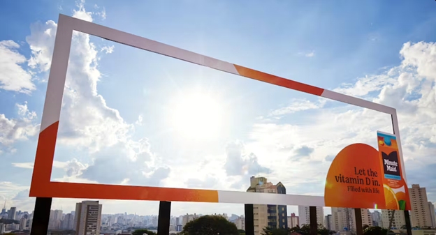
Their billboard design is almost a jarring contrast to the type we just described because it is mostly empty space. In fact, most of the billboard is hollow. The only thing you’ll find is the frame, and in the lower right-hand corner, the image of a giant orange and a carton of the company’s juice.
Written on the orange, you’ll find these words: “Let the vitamin D in. Filled with life.”
And upon reading those words, the reason for the billboard’s design becomes apparent. On sunny days, the sun shines right through the hollow space, its rays providing a bounty of vitamin D.
The simplicity of the design is staggering, and the campaign has been wildly successful, prompting thousands of people to share pictures and comment about it, which has done much to increase the brand’s visibility.
It’s truly an inspiring design. Unfortunately, the idea may not be perfectly applicable to your business, but the basic concept of minimalism can certainly be utilized, no matter what business you’re in, and we can help you find ways of doing exactly that if you’re interested in that approach.
Even if you’re not, our advertising professionals have decades of experience and would be happy to sit down with you and help you design a memorable campaign that will take your business to the next level. To get started just give our office a call at 404-671-9490.
