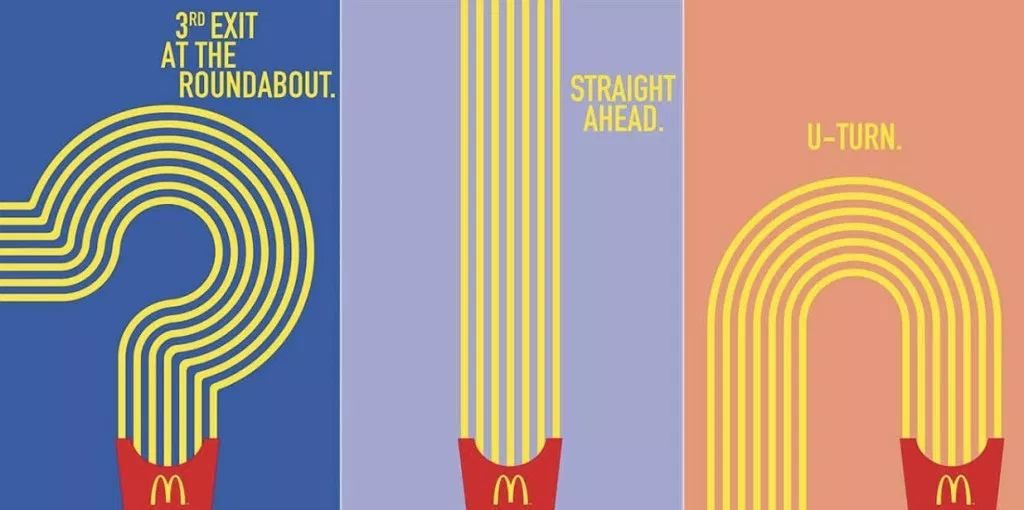
McDonald’s has been doing billboards for decades. Today, they are one of the biggest spenders in the Out of Home (OOH) arena.
But they don’t play by what are considered the “rules” of good billboard creative. And it doesn’t seem to matter.
Over the years, their campaigns have used various staples from their menu. An image of a Big Mac, a red box of fries, and of course, the golden arches.
Their early billboards didn’t use any images of their food choices or packaging, just gave directions to a restaurant, listed the 18 cent price of a hamburger, and promised speedy service. Now, the brand has become such a staple of the American culture, very few, if any, words are needed on their billboard advertising to send consumers their way.
In the example above, elongated french fries point the way to the closest restaurant. Past campaigns have won awards using “incomplete images.” Using only one of the golden arches with simply verbage “just missed us” to indicate the closest restaurant is behind the viewer. That campaign won the Outdoor Grand Prix award at the 2018 Cannes Lions.
No matter how you look at it, like it or not, McDonald’s is changing the game of OOH.
