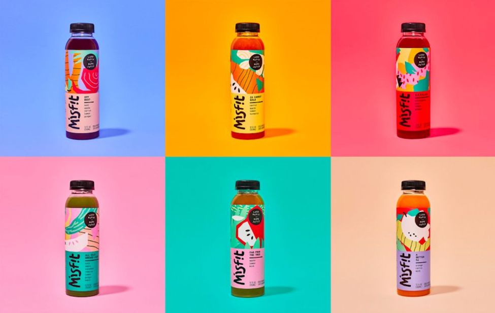
If you haven’t enjoyed a refreshing Misfit Juice, you’re missing out! Their juice products are honestly delicious, and their advertising campaigns are fun and oddly compelling to boot. Take this recent example as a classic case in point.
Taken as a whole, fruit isn’t really all that attractive, and some of the fruits that Misfit uses to make its line of drinks are downright ugly.
That’s okay though, the company has found a viable workaround and with the help of ad agency Gander, they’ve created some fun, colorful billboard designs that play to their strengths and basically ignore their weaknesses.

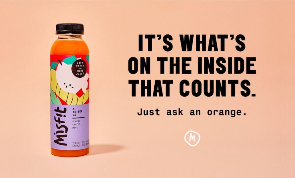
Take the orange juice ad. It’s on a creamsicle colored background with minimal text that reads “It’s what’s on the inside the counts. Just ask an orange.”
Beneath that is the company’s “M” logo and next to the text is a giant, brightly colored image of the company’s juice bottle.
That’s it. That’s the entire ad. It is a lesson in simplicity, and it is almost devastatingly effective.
The company’s owners know they’ve got a great product, and they don’t have to work to sell people on it. All they need to do really, is draw attention to themselves and their playful, fun brand, and that’s precisely what this design succeeds at doing.
The great thing about this kind of ad strategy is that it can work for any company, in any industry. In fact, it can be argued that it’s even more effective in industries that aren’t normally considered flashy or “sexy,” and let’s be honest – that describes a lot of different businesses! If you’re struggling to come up with a killer idea for your next ad campaign, we can help with that. Our advertising professionals have decades of experience, and we’d love the opportunity to sit down with you and map out ways we can help! Just give our office a call at 404-671-9490.
