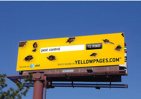
Whole books have been written on the basics of marketing in general, but effective billboard advertising is a bit of a different beast and surprisingly tricky to get right.
While it’s possible to find a number of scholarly articles about billboard advertising in particular, the essence of it can be boiled down into two key principles. If you get these two things right, everything else should more or less fall into place. Want to know what they are? Read on and we’ll tell you!
Here’s the key thing to remember about billboard ads. The vast majority of them will only be viewed by any given individual for a handful of seconds, usually as they’re traveling down a highway at high speeds.
Given that, you don’t want a billboard that requires a ton of time or concentration to read. For that reason, images are better than text by a wide margin.
That’s not to say you can’t have some text on your billboard ad, but you should consider every word carefully and don’t place more verbiage on your billboard than is absolutely necessary.
Tell your story with images, not words. Your future customers will thank you!
Clarity and Focus
Building on the above, and again, given that the average viewer is only going to have eyes on your billboard for a few seconds, you don’t want to try and convey a complicated idea. You want to convey a simple, compelling story to your viewers, the simpler the better.
Pick a single idea and run with it. Make sure that every element of your billboard’s design exists to serve and further that singular idea. If you find something that doesn’t, get rid of it and use it in some other ad campaign. The simpler your idea and the more deftly you execute it, the more effective your ad will be.
Of course, those two things are much easier said than done and if you’re struggling to work out how to put those two ideas into practice, the solution is simple. Just give our office a call at 404-671-9490 . We’ll be more than happy to help make your next ad campaign unforgettable.
