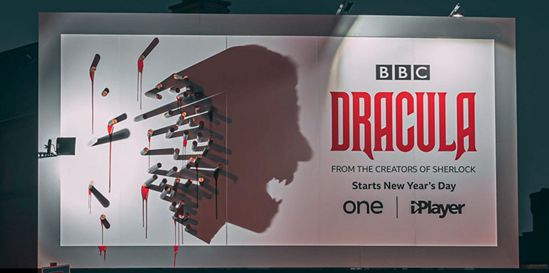
This month, we’re focused on the use of light and shadow in billboard advertising, which honestly, doesn’t get as much attention as it should.
Most people who design ad campaigns focus on the fundamentals. Text size and color, arresting images, short, punchy messages. Those things matter but you can get all of that right and still manage to create a perfectly acceptable, completely forgettable billboard that will get lost in the sea of competing billboards.
If you want to create something that will be remembered and have people talking about your brand, then you’ve got to do more.
The BBC understands this, and their recent campaign advertising their adaptation of Dracula makes use of light and shadow in a compelling way.
By day, the billboard looks rather mundane. A white field with the name “Dracula” written in red, and a variety of wooden stakes hammered into the billboard to the left of that.
As day turns to evening, however, the light mounted at one side of the billboard flickers on, and when it does, rays of light strike those wooden stakes, revealing a portrait of the vampire himself, rendered in shadow. Dracula, revealed!
The cool thing about this is that although it takes someone with a next-level creative brain to imagine an image that the interplay between light and objects on your billboard will create, and some serious engineering and mathematical chops to get the placements right, this is something that can work for just about any product in any industry.
Best of all, once you do have it right, the result is all but guaranteed to catch people’s attention and spark a conversation about your brand.
Need help firming up an idea for your next advertising campaign? We’ve got you covered. Just give us a call at 404-671-9490 and let us help you make advertising magic!
