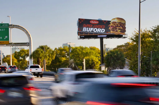
Designing a Roadside Billboard
Roadside billboards have been a vital resource in outdoor advertising for over a century. It is an efficient way to get in touch with all the different motorists traveling throughout the country. Ever wondered about the process it takes to design the creative phrases and images you see on a Billboard each day? Marketing geniuses brainstorm ideas day by day by following a few ground rules when designing:
- Shoot for simplicity!
Maximum 8 words or less- Typically, highway billboard audiences will only have 5-10 seconds to glance at the Ad and comprehend the message
- Size!
Messages need to be understood from a distance so try to go big
- Colors!
Graphics and colors need to be bright and saturated- Contrast and visibility are key factors
- Location!
Look for a location where the viewer will get at least 6-8 seconds of an uninterrupted view. This meaning that it is ideal to take consideration of trees, hills, and curves. Avoid a blocked view
- Themes!
Try to have a fun play on words to make your message stick
- Remember your Target Audience!
Use your environment to create a clever and witty message
By following these tips, Marketing Designers have been successful in bringing in clientele by the use of Roadside Billboards for over a century.
Get in contact with us today to see just how effective our designs can be for your company!

