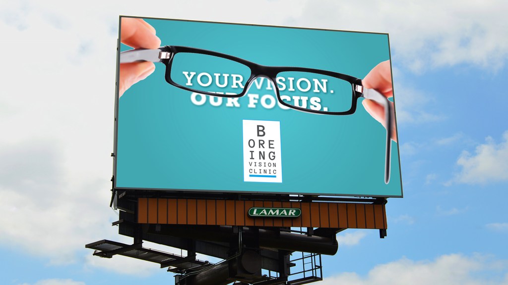
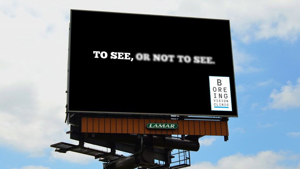
Vacation time is coming, meaning an increase of traffic, so it is time to clearly state your vision for new customers this summer just like how Boreing Vision Clinic has done in their most recent billboard advertising campaign. The Boreing Vision Clinic provides their customers with a whole new lens to see through using a unique graphic that makes customers look twice.
The optical illusions of blurring some of the words and having the others bold is a great comparison of our vision before getting our eyes checked versus after. It really illustrates the importance of how their focus is helping their patience have the best sight they can.
One of the graphics (below) says “Your Vision. Our Focus.”. over top of it is a pair of glasses. The words that the glasses cover is clear, and the ones not covered are blurry. This is a great example of showing their customers the difference it makes having their eyes checked. Another great part about this graphic is the uniqueness of the logo. They used the seeing chart and replaced the random letters with their business’s name. As simple as it is, it is also very memorable and creatively plays on the fact that they are a vision clinic.

The second graphic (below) is similar in showing the comparison in clear vision versus not clear. It says, “To See, Or Not To See”. These simple words speak louder when you add in the blurred and bold lettering. The simpleness also gives drivers a great amount of time to read and realize whether they need to get their eyes checked. Again, the placement and simpleness of the logo in the bottom right-hand corner does not take the focus off the emphasis of seeing.

This billboard campaign is another example of how to clearly state your business’s vision this summer as more and more people take vacations. It could be your opportunity to drive that traffic into your doors, showcase your product and services, and let customers know who you are. Come back this summer stronger and bolder than before.
