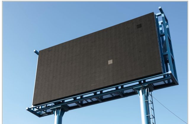
Digital billboards have been game-changers for the advertising industry. They allow for more freedom and flexibility, especially for advertisers who want or need to change their message on a regular basis. They’re simply more cost effective.
Of course, that’s only true if you design effective digital ads. Here are a few simple guidelines to get you started designing digital ads:
Keep It Simple
With a conventional billboard, if you want, you can really go over the top. In fact, some companies have been amazingly successful by being almost impossibly outlandish. Don’t do that where digital billboards are concerned. Simple is almost always better.
Hand in hand with that, you absolutely want to stick to a single idea. Don’t try to tell a complex story with your ad. One idea, compellingly rendered. That’s what you want to shoot for.
Keep Text Easy To Ready
That means avoiding the use of italic fonts or anything thin. When seen from 500 feet away, a thin font becomes virtually invisible. Bold sans serif fonts are your best option. Shoot for maximum contrast between text and background, but do avoid white backgrounds, which can be blinding.
Test Relentlessly
Because it’s so quick and easy to change things up when using the digital format, you can try a wide range of ideas over a relatively short span of time at minimal cost, and you should. Advertising is one part art and one part science, after all, and some experimentation will be required to find the right combination of words and images that really speak to your customers. Don’t be afraid of that and don’t shy away from it!
If you need help designing your next ad campaign, we’ve got you covered. Just give us a call at 404-671-9490.
